Frequency Distributions
A random sample of 1,200 college students were asked "What is your perception of your own body? Do you feel that you are overweight, underweight, or about right?" as part of a larger survey. The following table shows part of the responses:
What percentage of the sampled students fall into each category? , How are students divided across the three body image categories? Are they equally divided? If not, do the percentages follow some other kind of pattern? - These questions cannot be answered using the above figure.
However, both these questions will be easily answered once we summarize and look at the distribution of the variable Body Image (i.e., once we summarize how often each of the categories occurs).
In order to summarize the distribution of a categorical variable, we first create a table of the different values (categories) the variable takes, how many times each value occurs (count) and, more importantly, how often each value occurs (by converting the counts to percentages); this table is called a frequency distribution. Here is the frequency distribution for our example:
| Student | Body Image |
|---|---|
| student 25 | overweight |
| student 26 | about right |
| student 27 | underweight |
| student 28 | about right |
| student 29 | about right |
| Category | Count | Percent |
|---|---|---|
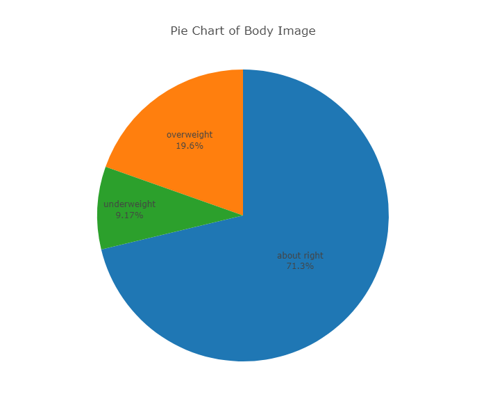
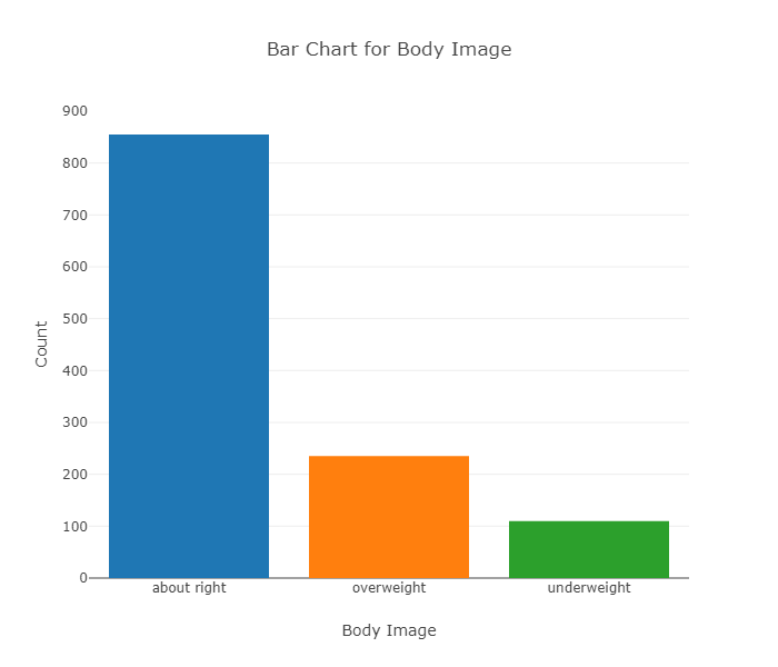
| About right | 855 | \( \frac{855}{1200} * 100 = 71.3%\) |
| Overweight | 235 | \( \frac{235}{1200} * 100 = 19.6%\) |
| Underweight | 110 | \( \frac{110}{1200} * 100 = 9.2%\) |
| Total | 1200 | 100% |
Describe the distribution of a categorical variable
In order to visualize the numerical summaries we've obtained, we need a graphical display. There are two simple graphical displays for visualizing the distribution of categorical data:
The Pie Chart :
The Bar Chart :
While both the pie chart and the bar chart help us visualize the distribution of a categorical variable, the pie chart emphasizes how the different categories relate to the whole, and the bar chart emphasizes how the different categories compare with each other.
The distribution of a categorical variable is summarized using: Graphical display : pie chart or bar chart, supplemented by Numerical summaries : category counts and percentages.
Explore the data collected from a Quantitative Variable
To display data from one quantitative variable graphically, we can use either the histogram or the stemplot or the boxplot.
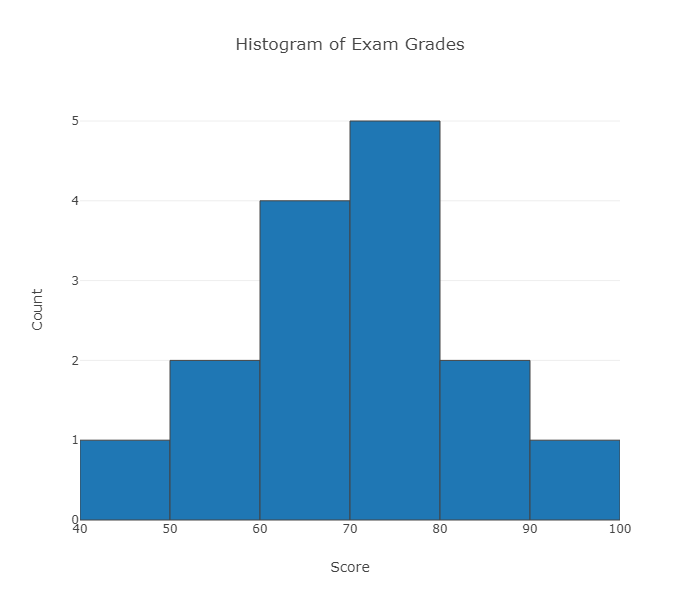
Example :Break the range of values into intervals and count how many observations fall into each interval. Here are the exam grades of 15 students: 88, 48, 60, 51, 57, 85, 69, 75, 97, 72, 71, 79, 65, 63, 73 We first need to break the range of values into intervals (also called "bins" or "classes"). In this case, since our dataset consists of exam scores, it will make sense to choose intervals that typically correspond to the range of a letter grade, 10 points wide: 40-50, 50-60, ... 90-100. By counting how many of the 15 observations fall in each of the intervals, we get the following table: The observation 60 was counted in the 60-70 interval.
To construct the histogram from this table we plot the intervals on the X-axis, and show the number of observations in each interval (frequency of the interval) on the Y-axis, which is represented by the height of a rectangle located above the interval:
The table above can also be turned into a relative frequency table using the following steps:
Add a row on the bottom and include the total number of observations in the dataset that are represented in the table.
Add a column, at the end of the table, and calculate the relative frequency for each interval, by dividing the number of observations in each row by the total number of observations.
It is also possible to determine the number of scores for an interval, if you have the total number of observations and the relative frequency for that interval. For instance, if we know that we have 15 scores (or observations) and the relative frequency is 0.13, we can determine the number of scores by multiplying the total number of observations by the relative frequency and rounding up to the next whole number: 15 * 0.13 = 1.95, which rounds up to 2 observations.
A relative frequency table, like the one above, can be used to determine the frequency of scores occurring at or across intervals. Here are some examples, using the above frequency table:
What is the percentage of exam scores that were 70 and up to, but not including, 80? To determine the answer, we look at the relative frequency associated with the [70-80) interval. The relative frequency is 0.33; to convert to percentage, multiply by 100 (0.33 * 100 = 33) or 33%.
What is the percentage of exam scores that are at least 70? To determine the answer, we need to:
Add together the relative frequencies for the intervals that have scores of at least 70 or above. Thus, would need to add together the relative frequencies from [70-80), [80-90), and [90-100] = 0.33 + 0.13 + 0.07 = 0.53.
To get the percentage, need to multiple the calculated relative frequency by 100. In this case, it would be 0.53 * 100 = 53 or 53%.
| Score | Count |
|---|---|
| [40-50) | 1 |
| [50-60) | 2 |
| [60-70) | 4 |
| [70-80) | 5 |
| [80-90) | 2 |
| [90-100] | 1 |
| Score | Count / Frequency | Relative frequency |
|---|---|---|
| [40-50) | 1 | 0.07 |
| [50-60) | 2 | 0.13 |
| [60-70) | 4 | 0.27 |
| [70-80) | 5 | 0.33 |
| [80-90) | 2 | 0.13 |
| [90-100] | 1 | 0.07 |
| Total | 15 |
Stemplot
The stemplot (also called stem and leaf plot) is another graphical display of the distribution of quantitative data.
Separate each data point into a stem and leaf, as follows :
The leaf is the right-most digit.
The stem is everything except the right-most digit.
So, if the data point is 34, then 3 is the stem and 4 is the leaf.
If the data point is 3.41, then 3.4 is the stem and 1 is the leaf
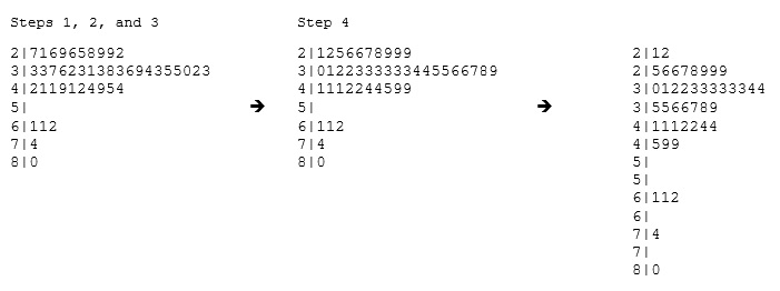
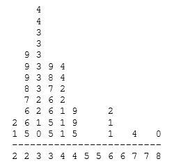
Example : 34 34 27 37 42 41 36 32 41 33 31 74 33 49 38 61 21 41 26 80 42 29 33 36 45 49 39 34 26 25 33 35 35 28 30 29 61 32 33 45 29 62 22 44
To make a stemplot :
Separate each observation into a stem and a leaf.
Write the stems in a vertical column with the smallest at the top, and draw a vertical line at the right of this column.
Go through the data points, and write each leaf in the row to the right of its stem.
Rearrange the leaves in an increasing order.
Note that when rotated 90 degrees counterclockwise, the stemplot visually resembles a histogram. This orientation makes the right-skewedness of the distribution clearly visible.
The stemplot has additional unique features: It preserves the original data. It sorts the data
Dotplot
The dotplot, like the stemplot, shows each observation, but displays it with a dot rather than with its actual value. Here is the dotplot for the ages of Best Actress Oscar winners.
The stemplot is a simple but useful visual display of quantitative data. Its principal virtues are :
Easy and quick to construct for small, simple datasets.
Retains the actual data.
Sorts (ranks) the data.
Stemplots and Dotplots are useful only for small datasets
Since for the most part we are not going to deal with very small data sets in this course, we will generally display the distribution of a quantitative variable using a histogram.
