Numerical Measures
The overall pattern of the distribution of a quantitative variable is described by its shape, center, and spread. By inspecting the histogram, we can describe the shape of the distribution, but we can only get a rough estimate for the center and spread. A description of the distribution of a quantitative variable must include, in addition to the graphical display, a more precise numerical description of the center and spread of the distribution. In this section we will learn:
how to quantify the center and spread of a distribution with various numerical measures;
some of the properties of those numerical measures; and
how to choose the appropriate numerical measures of center and spread to supplement the histogram
Mode : The three main numerical measures for the center of a distribution are the mode, the mean and the median. We identified the mode as the value where the distribution has a “peak” and saw examples when distributions have one mode (unimodal distributions) or two modes (bimodal distributions). Technically, the mode is the most commonly occurring value in a distribution. Example : 1 6 7 5 5 8 11 12 15; The modal value is 5 and the distribution is unimodal.
Mean : The mean is the average of a set of observations (i.e., the sum of the observations divided by the number of observations). If the n observations are \(x_1, x_2, ... , x_n\) their mean, which we denote by \( \overline{x} \) is therefore: \( \frac{x_1 + x_2 + ... + x_n}{n} \)
Example : 34 34 27 37 42 41 36 32 41 33 31 74 33 49 38 61 21 41 26 80 42 29 33 36 45 49 39 34 26 25 33 35 35 28 30 29 61 32 33 45 29 62 22 44. Then mean is 1687/44 = 38.3
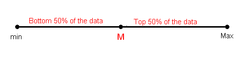
The median M is the midpoint of the distribution. It is the number such that half of the observations fall above, and half fall below. To find the median:
Order the data from smallest to largest.
Consider whether n, the number of observations, is even or odd.
If n is odd, the median M is the center observation in the ordered list. This observation is the one "sitting" in the (n + 1) / 2 spot in the ordered list.
If n is even, the median M is the mean of the two center observations in the ordered list. These two observations are the ones "sitting" in the n / 2 and n / 2 + 1 spots in the ordered list.
To find the mean number of goals scored per game, we would need to find the sum of all 192 numbers, then divide that sum by 192. Rather than add 192 numbers, we use the fact that the same numbers appear many times. For example, the number 0 appears 17 times, the number 1 appears 45 times, the number 2 appears 51 times, etc.
If we add up 17 zeros, we get 0. If we add up 45 ones, we get 45. If we add up 51 twos, we get 102. Repeated addition is multiplication.
Thus, the sum of the 192 numbers = 0(17) + 1(45) + 2(51) + 3(37) + 4(25) + 5(11) + 6(3) + 7(2) + 8(1) = 453.
The mean is 453 / 192 = 2.359.
This way of calculating a mean is sometimes referred to as a weighted average, since each value is "weighted" by its frequency. Note that, in this example, the values of 1, 2, and 3 are most heavily weighted.
| total # goals/game | frequency |
|---|---|
| 0 | 17 |
| 1 | 45 |
| 2 | 51 |
| 3 | 37 |
| 4 | 25 |
| 5 | 11 |
| 6 | 3 |
| 7 | 2 |
| 8 | 1 |
Comparing the Mean and the Median
Mean (\( \overline{x} \)) and the median (M) : two of the common measures of center, each describe the center of a distribution of values in a different way. The mean describes the center as an average value, in which the actual values of the data points play an important role. The median, on the other hand, locates the middle value as the center, and the order of the data is the key to finding it.
The mean is very sensitive to outliers (because it factors in their magnitude), while the median is resistant to outliers
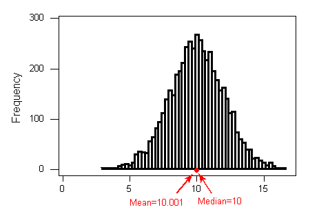
For symmetric distributions with no outliers: (\( \overline{x} \)) is approximately equal to M.
For skewed right distributions and/or datasets with high outliers: (\( \overline{x} \)) > M
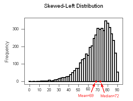
For skewed left distributions and/or datasets with low outliers: (\( \overline{x} \)) < M
We will therefore use (\( \overline{x} \)) as a measure of center for symmetric distributions with no outliers. Otherwise, the median will be a more appropriate measure of the center of our data.
The Current Population Survey conducted by the Census Bureau records the incomes of a large sample of U.S. households each month. What will be the relationship between the mean and median of the collected data? The mean will be bigger than the median
The SAT Math scores of 1,000 future engineers and physicists are recorded. What will be the relationship between the mean and median of the collected data? The mean will be smaller than the median
As we move the single right-most observation out to the right i.e. increase its value, the mean also moves to the right, while the median stays in its place. By moving the point to the extreme right we are creating an outlier, and outliers affect the mean and not the median. The mean is affected because it's a numerical average of all the values. The median is affected only by the order of the observations (which has not changed).
Measures of Spread
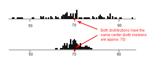
A measure of center by itself is not enough, though, to describe a distribution. Consider the following two distributions of exam scores. Both distributions are centered at 70 (the median of both distributions is approximately 70), but the distributions are quite different. The first distribution has a much larger variability in scores compared to the second one.
In order to describe the distribution, we therefore need to supplement the graphical display not only with a measure of center, but also with a measure of the variability (or spread) of the distribution. Range, Inter-quartile range (IQR), Standard deviation
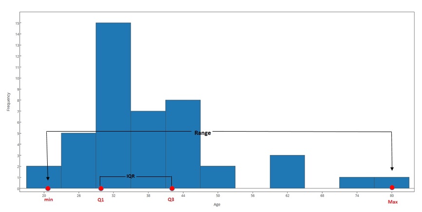
The range covered by the data is the most intuitive measure of variability. The range is exactly the distance between the smallest data point (min) and the largest one (Max). Range = Max - min Note: When we first looked at the histogram, and tried to get a first feel for the spread of the data, we were actually approximating the range, rather than calculating the exact range.
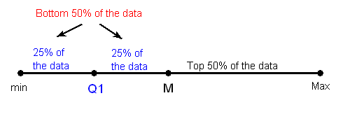
Inter-Quartile Range (IQR) : While the range quantifies the variability by looking at the range covered by ALL the data, the IQR measures the variability of a distribution by giving us the range covered by the MIDDLE 50% of the data.
Finding IQR :
Arrange the data in increasing order, and find the median M. Recall that the median divides the data, so that 50% of the data points are below the median, and 50% of the data points are above the median.
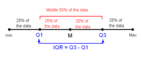
Find the median of the lower 50% of the data. This is called the first quartile of the distribution, and the point is denoted by Q1. Note from the picture that Q1 divides the lower 50% of the data into two halves, containing 25% of the data points in each half. Q1 is called the first quartile, since one quarter of the data points fall below it
Repeat this again for the top 50% of the data. Find the median of the top 50% of the data. This point is called the third quartile of the distribution, and is denoted by Q3. Note from the picture that Q3 divides the top 50% of the data into two halves, with 25% of the data points in each. Q3 is called the third quartile, since three quarters of the data points fall below it.
The middle 50% of the data falls between Q1 and Q3, and therefore: IQR = Q3 - Q1
The last picture shows that Q1, M, and Q3 divide the data into four quarters with 25% of the data points in each, where the median is essentially the second quartile. The use of IQR = Q3 - Q1 as a measure of spread is therefore particularly appropriate when the median M is used as a measure of center.
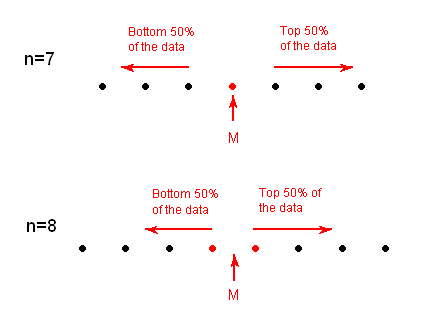
We can define a bit more precisely what is considered the bottom or top 50% of the data. The bottom (top) 50% of the data is all the observations whose position in the ordered list is to the left (right) of the location of the overall median M. The following picture will visually illustrate this for the simple cases of n = 7 and n = 8.
Note that when n is odd (as in n = 7 above), the median is not included in either the bottom or top half of the data; When n is even (as in n = 8 above), the data are naturally divided into two halves.

Relate measures of center and spread to the shape of the distribution, and choose the appropriate measures in different contexts
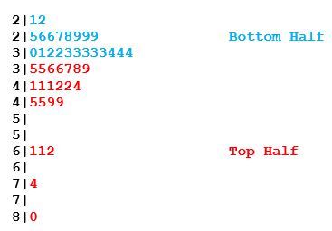
To find the IQR of the Best Actress Oscar winners distribution, it will be convenient to use the stemplot.
Q1 is the median of the bottom half of the data. Since there are 22 observations in that half, Q1 is the mean of the 11th and 12th ranked observations in that half: \( Q1 = \frac{30+31}{2} \)
Similarly, Q3 is the median of the top half of the data, and since there are 22 observations in that half, Q3 is the mean of the 11th and 12th ranked observations in that half: \( Q3 = \frac{42+42}{2} \) and IQR = (42 - 30.5) = 11.5
Note that in this example, the range covered by all the ages is 59 years, while the range covered by the middle 50% of the ages is only 11.5 years. While the whole dataset is spread over a range of 59 years, the middle 50% of the data is packed into only 11.5 years. Looking again at the histogram will illustrate this:
Using the IQR to Detect Outliers
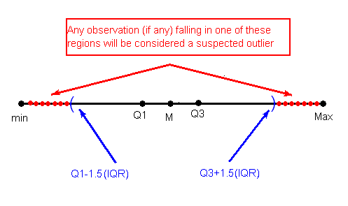
The IQR is used as the basis for a rule of thumb for identifying outliers.
The 1.5(IQR) Criterion for Outliers
An observation is considered a suspected outlier if it is:
below Q1 - 1.5(IQR) or
above Q3 + 1.5(IQR)
The following picture illustrates this rule:
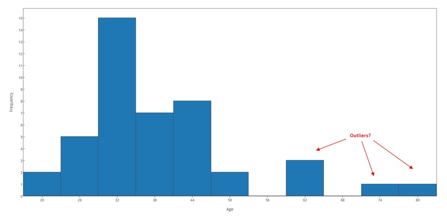
We can now use the 1.5(IQR) criterion to check whether the five observations should indeed be classified as outliers: For this example we found that Q1 = 30.5 and Q3 = 42; IQR = 11.5
Q1 - 1.5(IQR) = 30.5 - 1.5(11.5) = 13.25; Q3 + 1.5(IQR) = 42 + (1.5)(11.5) = 59.25
The 1.5(IQR) criterion tells us that any observation that is below 13.25 or above 59.25 is considered a suspected outlier. We therefore conclude that the observations 61, 61, 62, 74 and 80 should be flagged as suspected outliers in the distribution of ages. Note that since the smallest observation is 21, there are no suspected low outliers in this distribution.
Using the IQR to Detect Outliers
Even though it is an extreme value, if an outlier can be understood to have been produced by essentially the same sort of physical or biological process as the rest of the data, and if such extreme values are expected to eventually occur again, then such an outlier indicates something important and interesting about the process you're investigating, and it should be kept in the data.
If an outlier can be explained to have been produced under fundamentally different conditions from the rest of the data (or by a fundamentally different process), such an outlier can be removed from the data if your goal is to investigate only the process that produced the rest of the data.
An outlier might indicate a mistake in the data (like a typo, or a measuring error), in which case it should be corrected if possible or else removed from the data before calculating summary statistics or making inferences from the data (and the reason for the mistake should be investigated).
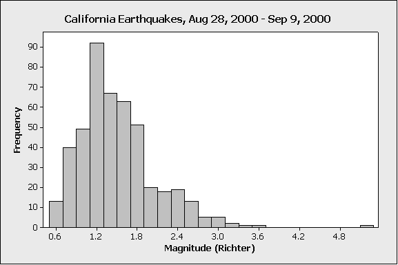
The above histogram displays the magnitude of 460 earthquakes in California, occurring in the year 2000, between August 28 and September 9:
On the very far right edge of the display (beyond 4.8), we see a low bar; this represents one earthquake (because the bar has height of 1) that was much more severe than the others in the data.
In this case, the outlier represents a much stronger earthquake, which is relatively rarer than the smaller quakes that happen more frequently in California
For many purposes, the relatively severe quakes represented by the outlier might be the most important (because, for instance, that sort of quake has the potential to do more damage to people and infrastructure). The smaller-magnitude quakes might not do any damage, or even be felt at all. So, for many purposes it could be important to keep this outlier in the data.
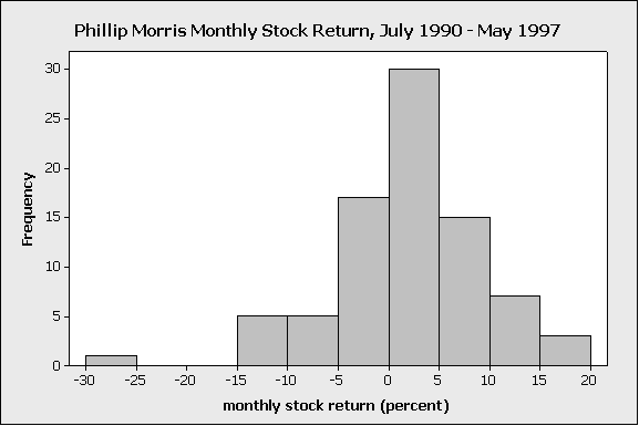
The above histogram displays the monthly percent return on the stock of Phillip Morris (a large tobacco company) from July 1990 to May 1997
On the display, we see a low bar far to the left of the others; this represents one month’s return (because the bar has height of 1), where the value of Phillip Morris stock was unusually low
The explanation for this particular outlier is that, in the early 1990s, there were highly-publicized federal hearings being conducted regarding the addictiveness of smoking, and there was growing public sentiment against the tobacco companies. The unusually low monthly value in the Phillip Morris dataset was due to public pressure against smoking, which negatively affected the company’s stock for that particular month.
In this case, the outlier was due to unusual conditions during one particular month that aren’t expected to be repeated, and that were fundamentally different from the conditions that produced the values in all the other months. So in this case, it would be reasonable to remove the outlier, if we wanted to characterize the ‘typical’ monthly return on Phillip Morris stock
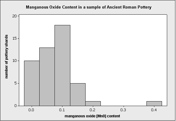
When archaeologists dig up objects such as pieces of ancient pottery, chemical analysis can be performed on the artifacts. The chemical content of pottery can vary depending on the type of clay as well as the particular manufacturing technique. The above histogram displays the results of one such actual chemical analysis, performed on 48 ancient Roman pottery artifacts from archaeological sites in Britain:
On the display, we see a low bar far to the right of the others; this represents one piece of pottery (because the bar has a height of 1), which has a suspiciously high manganous oxide value.
Based on comparison with other pieces of pottery found at the same site, and based on expert understanding of the typical content of this particular compound, it was concluded that the unusually high value was most likely a typo that was made when the data were published in the original 1980 paper (it was typed as “.394” but it was probably meant to be “.094”).
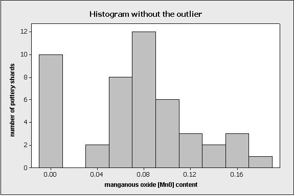
In this case, since the outlier was judged to be a mistake, it should be removed from the data before further analysis. In fact, removing the outlier is useful not only because it’s a mistake, but also because doing so reveals important structure that was otherwise hidden. This feature is evident on the next display:
When the outlier is removed, the display is re-scaled so that now we can see the set of 10 pottery pieces that had almost no manganous oxide. These 10 pieces might have been made with a different potting technique, so identifying them as different from the rest is historically useful. This feature was only evident after the outlier was removed.
Summary
The range covered by the data is the most intuitive measure of spread and is exactly the distance between the smallest data point (min) and the largest one (Max).
Another measure of spread is the inter-quartile range (IQR), which is the range covered by the middle 50% of the data
IQR = Q3 - Q1, the difference between the third and first quartiles. The first quartile (Q1) is the value such that one quarter (25%) of the data points fall below it, or the median of the bottom half of the data. The third quartile is the value such that three quarters (75%) of the data points fall below it, or the median of the top half of the data.
The IQR should be used as a measure of spread of a distribution only when the median is used as a measure of center. The IQR can be used to detect outliers using the 1.5(IQR) criterion. Outliers are observations that fall below Q1 - 1.5(IQR) or above Q3 + 1.5(IQR).