Measures of Spread - Boxplot
So far, in our discussion about measures of spread, the key players were:
The extremes (min and Max), which provide the range covered by all the data; and
The quartiles (Q1, M and Q3), which together provide the IQR, the range covered by the middle 50% of the data.
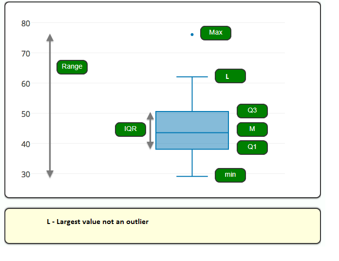
The combination of all five numbers (min, Q1, M, Q3, Max) is called the five number summary, and provides a quick numerical description of both the center and spread of a distribution. All this information can also be represented visually by using the boxplot.
The boxplot graphically represents the distribution of a quantitative variable by visually displaying the five-number summary and any observation that was classified as a suspected outlier using the 1.5(IQR) criterion.
There are several ways to plot the whiskers on a boxplot. One convention is to plot whiskers down to the minimum and up to the maximum value. We use the 1.5(IQR criterion), also known as the Tukey method for plotting whiskers. First, calculate the IQR, the difference between the 75th and 25th percentiles (or Q3 – Q1). Multiply the IQR by 1.5.
Add this value to the 75th percentile. If the value is greater than (or equal to) the maximum value in the dataset, draw the upper whisker to the maximum value. Otherwise, stop the whisker at the largest value that is less than 75th percentile + 1.5 * IQR. Plot any values that are greater than this as individual points that are outliers.
Similarly, subtract 1.5 * IQR from the 25th percentile. If this value is smaller than the minimum value in the dataset, draw the lower whisker to the minimum value. Otherwise, stop the whisker at the lowest value that is greater than 25th percentile – 1.5 * IQR. Plot any values that are smaller than this as individual points that are outliers.
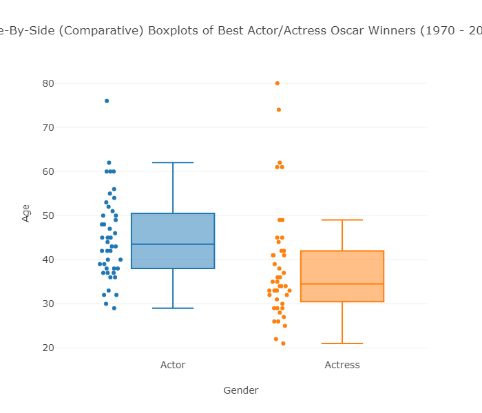
Using the Best Actress dataset, here is how we determine where to draw the whiskers:
Q3 = 42
Q1 = 30.5
IQR: 42 – 30.5 = 11.5
1.5 * IQR = 1.5 * 11.5 = 17.25
Q3 + 1.5 * IQR = 42 + 17.25 = 59.25
The largest observation that is less than or equal to 59.25 is 49 so we draw the upper whisker up to 49. All points above 49 are considered outliers (61, 61, 62, 74, 80).
Q1 – 1.5 * IQR = 30.5 – 17.25 = 13.25
The smallest observation that is greater than or equal to 13.5 is 21 so we draw the lower whisker down to 21, which is also the minimum. There are no outliers.
Measures of Spread - Boxplot (Multiple plots side by side)
The distribution of a quantitative variable is best represented graphically by a histogram. Boxplots are most useful when presented side-by-side for comparing and contrasting distributions from two or more groups.
So far we have examined the age distributions of Oscar winners for males and females separately. It will be interesting to compare the age distributions of actors and actresses who won best acting Oscars. To do that we will look at side-by-side boxplots of the age distributions by gender.
Recall also that we found the five-number summary and means for both distributions. Here are the results for the Best Actor and Best Actress datasets:
Actors: min = 31, Q1 = 38, M = 43.5, Q3 = 50.5, Max = 76
Actresses: min = 21, Q1 = 30.5, M = 34.5, Q3 = 42, Max = 80
Based on the graph and numerical measures, we can make the following comparison between the two distributions:
Center : The graph reveals that the age distribution of the males is higher than the females' age distribution. This is supported by the numerical measures. The median age for females (34.5) is lower than for the males (43.5). Actually, it should be noted that even the third quartile of the females' distribution (42) is lower than the median age for males. We therefore conclude that in general, actresses win the Best Actress Oscar at a younger age than actors do.
Spread : Judging by the range of the data, there is much more variability in the females' distribution (range = 59) than there is in the males' distribution (range = 47). On the other hand, if we look at the IQR, which measures the variability only among the middle 50% of the distribution, we see slightly more spread in the ages of males (IQR = 12.5) than females (IQR = 11.5). We conclude that among all the winners, the actors' ages are more alike than the actresses' ages. However, the middle 50% of the age distribution of actresses is more homogeneous than the actors' age distribution.
Outliers : We see that we have outliers in both distributions. There is only one high outlier in the actors' distribution (76, Henry Fonda, On Golden Pond), compared with five high outliers in the actresses' distribution.
Temperature of Pittsburgh vs. San Francisco - Boxplot (Multiple plots side by side)
In order to compare the average high temperatures of Pittsburgh to those in San Francisco we will look at the following side-by-side boxplots, and supplement the graph with the descriptive statistics of each of the two distributions.
When looking at the graph, the similarities and differences between the two distributions are striking. Both distributions have roughly the same center (medians are 61.4 for Pitt, and 62.7 for San Francisco).
However, the temperatures in Pittsburgh have a much larger variability than the temperatures in San Francisco (Range: 49 vs. 12. IQR: 36.5 vs. 5).
The practical interpretation of the results we got is that the weather in San Francisco is much more consistent than the weather in Pittsburgh, which varies a lot during the year.
Also, because the temperatures in San Francisco vary so little during the year, knowing that the median temperature is around 63 is actually very informative. On the other hand, knowing that the median temperature in Pittsburgh is around 61 is practically useless, since temperatures vary so much during the year, and can get much warmer or much colder.
Note that this example provides more intuition about variability by interpreting small variability as consistency, and large variability as lack of consistency.
Also, through this example we learned that the center of the distribution is more meaningful as a typical value for the distribution when there is little variability (or, as statisticians say, little "noise") around it. When there is large variability, the center loses its practical meaning as a typical value
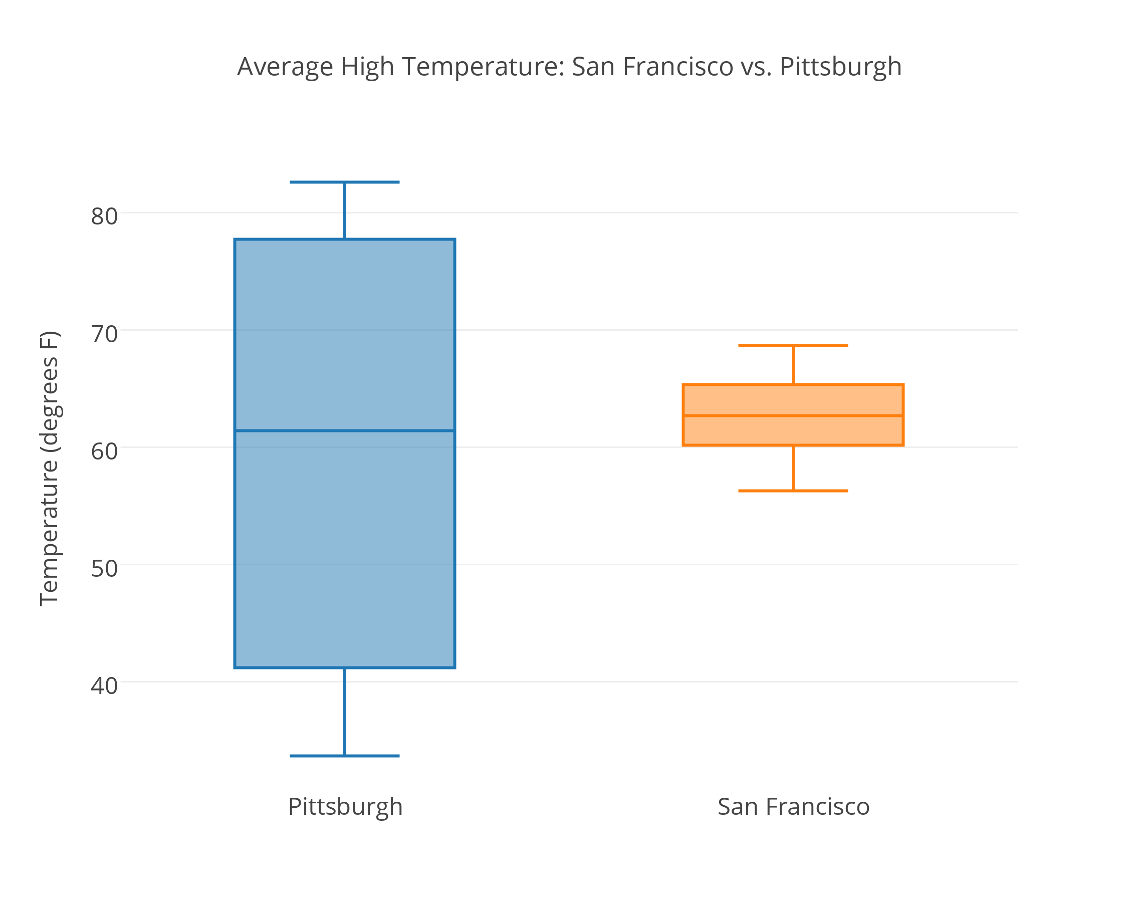
| Statistic | San Francisco | Pittsburgh |
|---|---|---|
| min | 56.3 | 33.7 |
| Q1 | 60.2 | 41.2 |
| Median | 62.7 | 61.4 |
| Q3 | 65.35 | 77.75 |
| Max | 68.7 | 82.6 |
Boxplot
The five-number summary of a distribution consists of the median (M), the two quartiles (Q1, Q3) and the extremes (min, Max).
The five-number summary provides a complete numerical description of a distribution. The median describes the center, and the extremes (which give the range) and the quartiles (which give the IQR) describe the spread.
The boxplot graphically represents the distribution of a quantitative variable by visually displaying the five number summary and any observation that was classified as a suspected outlier using the 1.5 (IQR) criterion.
Boxplots are most useful when presented side-by-side to compare and contrast distributions from two or more groups.