Introduction to Statistics Package Exercises
Purpose of Statistics Package Exercises : The Probability & Statistics course focuses on the processes you use to convert data into useful information. This involves
Collecting data,
Summarizing data, and
Interpreting data.
In addition to being able to apply these processes, you can learn how to use statistical software packages to help manage, summarize, and interpret data. The statistics package exercises included throughout the course provide you the opportunity to explore a dataset and answer questions based on the output using R, Statcrunch, TI Calculator, Minitab, or Excel. In each exercise, you can choose to view instructions for completing the activity in R, Statcrunch, TI Calculator, Minitab, or Excel, depending on which statistics package you choose to use.
The statistics package exercises are an extension of activities already embedded in the course and require you to use a statistics package to generate output and answer a different set of questions.
To Download R
To download R, a free software environment for statistical computing and graphics, go to: https://www.r-project.org/ This link opens in a new tab and follow the instructions provided.
Using R
Throughout the statistics package exercises, you will be given commands to execute in R. You can use the following steps to avoid having to type all of these commands in by hand:
Highlight the command with your mouse.
On the browser menu, click "Edit," then "Copy."
Click on the R command window, then at the top of the R window, click "Edit," then "Paste."
You may have to press
to execute the command. R Version
The R instructions are current through version 3.2.5 released on April 14, 2016. Instructions in these statistics package exercises may not work with newer releases of R.
For help with installing R for MAC OS X or Windows click here
Statistics Package Exercise: Exploring Variables in a Dataset
Learn how to open and examine a dataset.
Practice classifying variables by their type: quantitative or categorical.
Learn how to handle categorical variables whose values are numerically coded.
Background to Dataset
Clinical depression is the most common mental illness in the United States, affecting 19 million adults each year (Source: NIMH, 1999). Nearly 50% of individuals who experience a major episode will have a recurrence within 2 to 3 years. Researchers are interested in comparing therapeutic solutions that could delay or reduce the incidence of recurrence.
In a study conducted by the National Institutes of Health, 109 clinically depressed patients were separated into three groups, and each group was given one of two active drugs (imipramine or lithium) or no drug at all. For each patient, the dataset contains the treatment used, the outcome of the treatment, and several other interesting characteristics.
Here is a summary of the variables in our dataset:
Hospt: The patient's hospital, represented by a code for each of the 5 hospitals (1, 2, 3, 5, or 6)
Treat: The treatment received by the patient (Lithium, Imipramine, or Placebo)
Outcome: Whether or not a recurrence occurred during the patient's treatment (Recurrence or No Recurrence)
Time: Either the time in days till the first recurrence, or if a recurrence did not occur, the length in days of the patient's participation in the study.
AcuteT: The time in days that the patient was depressed prior to the study.
Age: The age of the patient in years, when the patient entered the study.
Gender: The patient's gender (1 = Female, 2 = Male)
R Instructions
To open R (a free software environment for statistical computing and graphics) with the data preloaded, right-click here and choose "Save Target As" to download the file to your computer. Then find the downloaded file and double-click it to open it in R.
The data have been loaded into the data frame depression. Enter the command
depression
to see the data.
Note: Using R - Throughout the statistics package exercises in this course, you will be given commands to execute in R. If you type them in by hand be aware that R is sensitive to capitalization, spelling, and format. After you type a command into the R console press
to execute the command. You can use the following steps to avoid having to type all of these commands in by hand: Highlight the command with your mouse.
On the browser menu, click "Edit," then "Copy."
Click on the R command window, then at the top of the R window, click "Edit," then "Paste."
You may have to press
to execute the command. When you enter the command
depression
into R, you will see a large data table. Each row of this table contains the values of the variables associated with a single individual, and the different variables are separated into columns. The columns are labeled with the variable names.
If we simply wanted to observe only Age information we can extract that specific variable from the data frame by connecting the data frame name to the column name using the $ symbol, such as in the following command:
depression$Age
Often it is easier to use labels for categorical variables that are as close as possible to the meanings of the categories. Now we will recode the variable gender with the labels "Male" and "Female." Copy the entire following command into R.
depression$Gender = replace(depression$Gender,depression$Gender==1,'Female');
depression$Gender = replace(depression$Gender,depression$Gender==2,'Male');
depression$Gender
Remember, you may have to press
to execute the command. Notice that the column Gender now contains the meaningful labels "Female" and "Male" where before it contained "1" and "2" codes.
Note: Using R - To learn more about any command names you see in these notes, enter
help(commandname)
or into R or check out the resources listed under the Help menu.
Q. What are the categorical variables in this dataset?
The categorical variables are 1) Hostp because the numbers represent codes, which are used to identify individual hospitals and place them into categories.
As such, the numbers used for the codes (1, 2, 3, 5, and 6) have no arithmetic meaning; 2) Treat because the treatment received by the patients is in the form of categories (Lithium, Imipramine, or Placebo); 3) Outcome since recurrence is in the form of two categories (Recurrence or No Recurrence) and 4) Gender because the numbers represent two distinct categories: Female and Male.
Thus, the numbers used to represent gender (1 = Female; 2 = Male) have no arithmetic meaning.
Q. What are the quantitative variables in this dataset?
The quantitative variables are 1) Time since it can take on multiple numerical values, which have arithmetic meaning (i.e., it makes sense to add, subtract, multiply, divide, or compare the magnitude of such values);
2) Age since it can take on multiple numerical values, which represent a characteristic of the patient; and 3) AcuteT because it can take on multiple numerical values to represent a characteristic of the patient.
Statistics Package Exercise 2 : Tallying Data and Creating Pie Charts
The same survey that asked 1,200 U.S. college students about their body perception also asked the following question:
"With whom do you find it easiest to make friends?" (opposite sex, same sex or no difference).
In this activity we will use the collected data to:
learn how to tally our data into a table of counts and percents.
learn how to produce a pie chart.
R Instructions
To open R with the dataset preloaded, right-click here and choose "Save Target As" to download the file to your computer. Then find the downloaded file and double-click it to open it in R.
The data have been loaded into the data frame 'friends'. Enter the command
friends
to see the data.
You can scroll up and down to see how 1,200 men and women answered the question: "With whom do you find it easiest to make friends?"
Notice that the column title in the data frame friends is Friends. The column title Friends is the variable name, while the data frame name is friends. The subtle difference is the capital F in the column title. R is sensitive to capitalization so R identifies friends and Friends as two different things. To extract a specific variable from a data frame there are many methods, the simplest method is to use the $ to identify the desired variable (column title) within the data frame, or
friends$Friends
Obviously the raw data is not very useful so we will summarize it using a table. To get a summary table of the data, copy and paste the next commands into R (and press
if necessary to execute the command): t = table(friends$Friends); t
Note: Using R-When you assign a value to a variable, R will not display the value unless you ask for the display by executing the variable name as a command in the console.
The same method is used below when the summary table for Friends is converted to percentages and assigned to the variable percent. Executing the variable name to see its contents may seem like an unnecessary extra step, but the convention allows you to assign a large amount of data to a variable and not fill your screen with the result (which could be millions of numbers) unless you really want to see it.
To see the proportion of the total in each category, copy and paste the command:
prop = prop.table(t);
prop
To see the percentage of the total in each category, copy and paste the command:
percent=prop.table(t)*100;
percent
Finally, copy and paste the next command to create a pie chart of your data:
pie(t)
The following alternate version of the pie chart command will produce a chart with more informative labels. First we will modify our percent table so that each value is rounded to one decimal place.
pf = round(percent,1);
pf
Next we will create a label that will include the category name and the percent as the labels for each section of the pie chart. R defaults to alphabetical order for tables and graphic creation so if you create your own labels list the names accordingly.
lbl = paste(c("No difference","Opposite sex","Same sex"),pf,"%",sep=" ");
lbl
Finally, create the pie chart with the new label added
pie(t,label=lbl)
Q. Describe the distribution of the variable "friends" in context:
The students are NOT divided equally among the three categories. About 50% of the students find it as easy to make friends with the opposite sex as with the same sex. Among the remaining 50% of the students, the majority (36.2%) find it easier to make friends with people of the opposite sex, and the remainder (13.7%) find it easier to make friends with people of their own sex.
Statistics Package Exercise: Creating and Describing Histograms
We will use the Best Actor Oscar winners (1970-2013) to learn how to create a histogram using a statistics package, and practice what we've learned about describing the histogram.
R Instructions
To open R with the dataset preloaded, right-click here and choose "Save Target As" to download the file to your computer. Then find the downloaded file and double-click it to open it in R.
The data have been loaded into the data frame actor_age
. Enter the command
actor_age
to see the data. The only variable (column title) in the data frame actor_age is Age .
To create a histogram of the actors' age data we can use the following code:
hist(actor_age$Age)
Notice the default settings in R are to use the variable name, in this case
actor_age$Age
in the title and x-axis label. In addition, the default y-axis is "Frequency." A good graphic is a well-labeled graphic. We can modify all of these settings with a few additional parameters added into the hist() command.
For example, if you want to add an x-axis label and remove the title of the histogram, use the following code:
hist(actor_age$Age, xlab="Age of Best Actor Oscar Winners (1970-2013)", main="")
If you want to modify the x-axis and y-axis label and the title use the following code:
hist(actor_age$Age, xlab="Age of Best Actor Oscar Winners (1970-2013)", ylab="Number of Actors", main="Best Actor Oscar Winners Ages")
Try replacing the x-axis label, y-axis label, and title with your own modified labels.
Another possible modification to the histogram is the number of bins. R uses an algorithm to determine the optimal number of bins based on the data, but in some cases you may want to modify the number of bins yourself. You can add the parameter breaks= into the hist()
command which will tell R to make that many breaks in the data. R will not always do the exact number of breaks if it is not possible, but it will provide a close approximation. For example, let's try 8 breaks:
hist(actor_age$Age, breaks=8, xlab="Age of Best Actor Oscar Winners (1970-2013)", main="")
Try replacing the number of "breaks" with 5 or 20. Which histogram gives the right amount of detail-neither too little nor too much?
Note: Using R-If you are looking at a graph in R, you may find that the command window (the one labeled "R Console") is not responsive. That is because the graph window is the "active" window. Click on the command window to make it the active window. In addition, notice that R will always overwrite your current graphic with a new graphic. Enter the code
x11()
and press prior to each new graphic command and R will create a new window for that graphic.
Q. In the textbox below, describe the distribution of the ages of the Best Actor Oscar winners. Be sure to address shape, center, spread and outliers. When you are done, compare your answer to ours.
Shape: the distribution is skewed right. This means that most actors receive the best acting Oscar at a relatively younger age (before age 48), and fewer at an older age.
Center: The distribution seems to be centered at around 42-43. This means that about half the actors are 42 or younger when they receive the Oscar, and about half are older.
Spread: The age distribution ranges from about 30 to about 75. The entire dataset is covered, then, by a range of 45 years. It should be noted, though, that there is one high outlier at around age 75, and the rest of the data ranges only from 30 to 60.
Outliers: As mentioned above, there is one high outlier at around age 75.
Statistics Package Exercise: Interpreting The Five Number Summary
In this activity, we will use the Best Actor Oscar winners (1970-2013) to:
learn how to use a statistics package to produce the numerical measures, or "descriptive statistics" of a distribution.
get some information about the distribution from its five-number summary.
R Instructions
To open R with the dataset preloaded, right-click here and choose "Save Target As" to download the file to your computer. Then find the downloaded file and double-click it to open it in R.
The data have been loaded into the data frame actor_age . Enter the command
actor_age
to see the data. The only variable (column title) in the data frame actor_age is Age .
The following command will show you the five-number summary for the actors' age data and the mean value of the data as well:
summary(actor_age$Age)
To get specific descriptive statistics from the data set consider the following commands:
For the Mean:
mean(actor_age$Age)
For the Standard Deviation:
sd(actor_age$Age)
For the Variance:
var(actor_age$Age)
For the Median:
median(actor_age$Age
For the Inter-quartile range:
IQR(actor_age$Age)
For the Minimum:
min(actor_age$Age)
For the Maximum:
max(actor_age$Age)
For the Sample Size (n):
length(actor_age$Age)
For the First Quartile (25th percentile, Q1):
quantile(actor_age$Age, 0.25)
For the Third Quartile (75th percentile, Q3):
quantile(actor_age$Age, 0.75)
Q. Getting information from the output: a. How many observations are in this data set? b. What is the mean age of the actors who won the Oscar? c. What is the five-number summary of the distribution?
a. There are n = 44 observations in the data set (representing the age of the Best Actor Oscar winners of the 44 years from 1970 through 2013).
b. Mean = 44.98
c. The five-number summary is: min = 29, Q1 = 38, M = 43.5, Q3 = 50.5, Max = 76
Q. Get information from the five-number summary: a. Half of the actors won the Oscar before what age? b. What is the range covered by all the actors' ages? c. What is the range covered by the middle 50% of the ages?
a. Half the actors won the Oscar before age 43.5 (the median). b. The range covered by all the ages is: Range = Max - min = 76 - 29 = 47. c. The range covered by the middle 50% of the ages is: IQR = Q3 - Q1 = 50.5 - 38 = 12.5
Statistics Package Exercise: Creating Side-by-Side Boxplots
The objectives of this activity are:
to teach you how to use to produce side-by-side boxplots and the relevant descriptive statistics,
to let you practice comparing and contrasting distributions, and
to help you gain more intuition about variability through the interpretation of your results in context.
The percentage of each entering Freshman class that graduated on time was recorded for each of six colleges at a major university over a period of several years. (Source: This data is distributed with the software package, Data Desk. (1993). Ithaca, NY: Data Description, Inc., and appears in http://lib.stat.cmu.edu/DASL/)
In order to compare the graduation rates among the different colleges, we will create side-by-side boxplots (graduation rate by college), and supplement the graph with numerical measures. Follow the instructions, and then answer the questions based on the output you got.
R Instructions
To open R with the dataset preloaded, right-click here and choose "Save Target As" to download the file to your computer. Then find the downloaded file and double-click it to open it in R.
The data have been loaded into the data frame grad_data . Enter the command
grad_data
to see the data. There are 6 variables (column titles) in the data frame grad_data : College.A , College.B , College.C , College.D , College.E , and College.F .
You should see graduation data for six colleges over the past eight years. Copy the next command to see a summary of the data for each college:
summary(grad_data)
By using the summary() command on the data frame instead of an individual variable the summary statement of the five number summary and mean are provided for each variable in the data frame.
Finally, copy the next command to see side-by-side boxplots of the graduation data for the six colleges:
boxplot(grad_data)
Just as we did with the histogram we can add x-axis and y-axis labels and titles using the same additional parameters in the boxplot() command, xlab= , ylab= , and main= . For example:
boxplot(grad_data, xlab="Colleges",ylab ="Graduation Rates", main="Comparison of Graduation Rates")
We can also modify the direction of the boxes by adding another parameter horizontal=TRUE . For example:
boxplot(grad_data, horizontal=TRUE, ylab="Colleges",xlab ="Graduation Rates", main="Comparison of Graduation Rates")
Notice that you must switch the x and y-axis labels when you make a horizontal boxplot.
Note: Using R-Use the mouse to grab the corner of the graph window and change its shape. If you make the window wider, you see a label for each boxplot. While the graph window is the active window, try clicking the File menu. If you hold the mouse over 'Copy to Clipboard,' you see two ways that you can copy a graph for pasting into another document. This is how you use R to create data graphs for reports.
R coding Note for reference only: The above command works because all six variables are listed in separate columns. Data organization often plays a role in how you structure an R command. For example, if the data was instead organized into two columns GradRate and College in a new data frame called grad2 , where GradRate contained all the numeric responses and College contained the labels A, B, C, etc., then the code would be as follows:
boxplot(grad2$GradRate~grad2$College)
Statistics Package Exercise: Calculating the Standard Deviation
The concept of standard deviation is less intuitive as a measure of spread than the range or the IQR. The following activity is designed to help you develop a better intuition for the standard deviation.
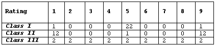
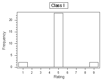
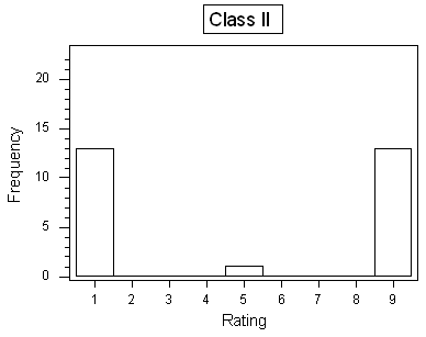
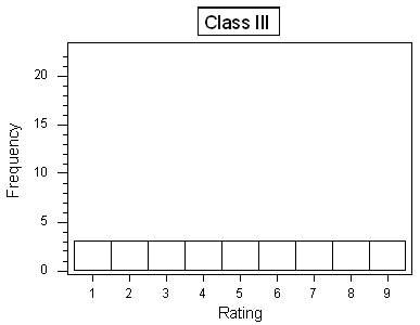
Background At the end of a statistics course, the 27 students in the class were asked to rate the instructor on a number scale of 1 to 9 (1 being "very poor," and 9 being "best instructor I've ever had"). The following table provides three hypothetical rating data
R Instructions
To open R with the dataset preloaded, right-click here and choose "Save Target As" to download the file to your computer. Then find the downloaded file and double-click it to open it in R.
The data have been loaded into the variable ratings which has three variables (column titles) Class.I , Class.II , and Class.III .
Enter the command
ratings
to see the data.
Now you can calculate the standard deviations for each variable with the command:
sapply(ratings, sd)
Note: Using R-Notice that R understands that your three columns represent different data sets with different names, and R computes the standard deviations of the three data sets separately. The above code can easily be modified for other commands for descriptive statistics such as mean or median .
If the data frame is formatted differently, consider the aggregate() function instead of sapply() .
Q. What are the standard deviations of the three rating distributions? Was your intuition correct?
Here are the three standard deviations:Class I: 1.6Class II: 4.0Class III: 2.6Note that through this example, we also learn that the number of distinct values represented in a histogram does not necessarily indicate greater variability.
Q. Assume that the average rating in each of the three classes is 5 (which should be visually reasonably clear from the histograms), and recall the interpretation of the SD as a "typical" or "average" distance between the data points and their mean. Judging from the table and the histograms, which class would have the largest standard deviation, and which one would have the smallest standard deviation? Explain your reasoning.
In class I, almost all the ratings are 5, which is also the mean. The average distance between the observations and the mean, then, would be very small. In class II most of the observations are far from the mean (at 1 or 9). The average distance between the observations and the mean in this case would be larger. Class III is the case where some of the observations are close to the mean, and some are far, so the average distance between the observations and the mean would be somewhere in between class I and II. This observation would lead me to conclude that the standard deviation would be ranked (from smallest to largest): Class I, Class III, Class II.