Downloading and Prepping Data
Dataset: Immigration to Canada from 1980 to 2013 - International migration flows to and from selected countries - The 2015 revision from United Nation's website.
The dataset contains annual data on the flows of international migrants as recorded by the countries of destination.
The data presents both inflows and outflows according to the place of birth, citizenship or place of previous / next residence both for foreigners and nationals.
For this lesson, we will focus on the Canadian Immigration data
Import Primary Modules. The first thing we'll do is import two key data analysis modules: pandas and Numpy.
import numpy as np  # useful for many scientific computing in Python
import pandas as pd # primary data structure library
Let's download and import our primary Canadian Immigration dataset using pandas read_excel() method.
Normally, before we can do that, we would need to download a module which pandas requires to read in excel files. This module is xlrd.
You would need to run the following line of code to install the xlrd module:
!conda install -c anaconda xlrd --yes
Download the dataset and read it into a pandas dataframe.
df_can = pd.read_excel('https://s3-api.us-geo.objectstorage.softlayer.net/cf-courses-data/CognitiveClass/DV0101EN/labs/Data_Files/Canada.xlsx',
                       sheet_name='Canada by Citizenship',
                       skiprows=range(20),
                       skipfooter=2
                      )

print('Data downloaded and read into a dataframe!')
Let's take a look at the first five items in our dataset.
df_can.head()
Let's find out how many entries there are in our dataset.
# print the dimensions of the dataframe
print(df_can.shape)
Clean up data. We will make some modifications to the original dataset to make it easier to create our visualizations. Refer to Introduction to Matplotlib and Line Plots lab for the rational and detailed description of the changes.
Clean up the dataset to remove columns that are not informative to us for visualization (eg. Type, AREA, REG).
df_can.drop(['AREA', 'REG', 'DEV', 'Type', 'Coverage'], axis=1, inplace=True)
# let's view the first five elements and see how the dataframe was changed
df_can.head()
Notice how the columns Type, Coverage, AREA, REG, and DEV got removed from the dataframe.
Rename some of the columns so that they make sense.
df_can.rename(columns={'OdName':'Country', 'AreaName':'Continent','RegName':'Region'}, inplace=True)
# let's view the first five elements and see how the dataframe was changed
df_can.head()
Notice how the column names now make much more sense, even to an outsider.
For consistency, ensure that all column labels of type string.
# let's examine the types of the column labels
all(isinstance(column, str) for column in df_can.columns)
Notice how the above line of code returned False when we tested if all the column labels are of type string. So let's change them all to string type.
df_can.columns = list(map(str, df_can.columns))


# let's check the column labels types now
all(isinstance(column, str) for column in df_can.columns)
Set the country name as index - useful for quickly looking up countries using .loc method.
df_can.set_index('Country', inplace=True)
# let's view the first five elements and see how the dataframe was changed
df_can.head()
Notice how the country names now serve as indices.
Add total column.
df_can['Total'] = df_can.sum(axis=1)


# let's view the first five elements and see how the dataframe was changed
df_can.head()
Now the dataframe has an extra column that presents the total number of immigrants from each country in the dataset from 1980 - 2013. So if we print the dimension of the data, we get:
print ('data dimensions:', df_can.shape)
So now our dataframe has 38 columns instead of 37 columns that we had before.
# finally, let's create a list of years from 1980 - 2013
# this will come in handy when we start plotting the data
years = list(map(str, range(1980, 2014)))


years
Histogram
A histogram is a way of representing the frequency distribution of numeric dataset. The way it works is it partitions the x-axis into bins, assigns each data point in our dataset to a bin, and then counts the number of data points that have been assigned to each bin.
So the y-axis is the frequency or the number of data points in each bin. Note that we can change the bin size and usually one needs to tweak it so that the distribution is displayed nicely.
Question: What is the frequency distribution of the number (population) of new immigrants from the various countries to Canada in 2013?
Before we proceed with creating the histogram plot, let's first examine the data split into intervals. To do this, we will us Numpy's histrogram method to get the bin ranges and frequency counts as follows:
# let's quickly view the 2013 data
df_can['2013'].head()
# np.histogram returns 2 values
count, bin_edges = np.histogram(df_can['2013'])

print(count) # frequency count
print(bin_edges) # bin ranges, default = 10 bins
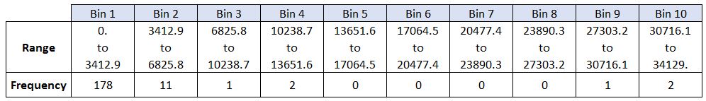
By default, the `histrogram` method breaks up the dataset into 10 bins. The figure below summarizes the bin ranges and the frequency distribution of immigration in 2013. We can see that in 2013:
178 countries contributed between 0 to 3412.9 immigrants
11 countries contributed between 3412.9 to 6825.8 immigrants
1 country contributed between 6285.8 to 10238.7 immigrants, and so on..
We can easily graph this distribution by passing kind=hist to plot().
df_can['2013'].plot(kind='hist', figsize=(8, 5))


plt.title('Histogram of Immigration from 195 Countries in 2013') # add a title to the histogram
plt.ylabel('Number of Countries') # add y-label
plt.xlabel('Number of Immigrants') # add x-label


plt.show()
In the plot obtained from above, the x-axis represents the population range of immigrants in intervals of 3412.9. The y-axis represents the number of countries that contributed to the aforementioned population.
Notice that the x-axis labels do not match with the bin size. This can be fixed by passing in a xticks keyword that contains the list of the bin sizes, as follows:
# 'bin_edges' is a list of bin intervals
count, bin_edges = np.histogram(df_can['2013'])


df_can['2013'].plot(kind='hist', figsize=(8, 5), xticks=bin_edges)


plt.title('Histogram of Immigration from 195 countries in 2013') # add a title to the histogram
plt.ylabel('Number of Countries') # add y-label
plt.xlabel('Number of Immigrants') # add x-label


plt.show()
Side Note: We could use df_can['2013'].plot.hist(), instead. In fact, throughout this lesson, using some_data.plot(kind='type_plot', ...) is equivalent to some_data.plot.type_plot(...). That is, passing the type of the plot as argument or method behaves the same.
We can also plot multiple histograms on the same plot. For example, let's try to answer the following questions using a histogram.
Question: What is the immigration distribution for Denmark, Norway, and Sweden for years 1980 - 2013?
# let's quickly view the dataset
df_can.loc[['Denmark', 'Norway', 'Sweden'], years]

# generate histogram
df_can.loc[['Denmark', 'Norway', 'Sweden'], years].plot.hist()
The plot generated from above does not look right!
Don't worry, you'll often come across situations like this when creating plots. The solution often lies in how the underlying dataset is structured.
Instead of plotting the population frequency distribution of the population for the 3 countries, pandas instead plotted the population frequency distribution for the years.
This can be easily fixed by first transposing the dataset, and then plotting as shown below.
# transpose dataframe
df_t = df_can.loc[['Denmark', 'Norway', 'Sweden'], years].transpose()
df_t.head()


# generate histogram
df_t.plot(kind='hist', figsize=(10, 6))

plt.title('Histogram of Immigration from Denmark, Norway, and Sweden from 1980 - 2013')
plt.ylabel('Number of Years')
plt.xlabel('Number of Immigrants')

plt.show()
Let's make a few modifications to improve the impact and aesthetics of the previous plot:
increase the bin size to 15 by passing in bins parameter
set transparency to 60% by passing in alpha paramemter
label the x-axis by passing in x-label paramater
change the colors of the plots by passing in color parameter
# let's get the x-tick values
count, bin_edges = np.histogram(df_t, 15)

# un-stacked histogram
df_t.plot(kind ='hist',
          figsize=(10, 6),
          bins=15,
          alpha=0.6,
          xticks=bin_edges,
          color=['coral', 'darkslateblue', 'mediumseagreen']
         )

plt.title('Histogram of Immigration from Denmark, Norway, and Sweden from 1980 - 2013')
plt.ylabel('Number of Years')
plt.xlabel('Number of Immigrants')

plt.show()
Tip: For a full listing of colors available in Matplotlib, run the following code in your python shell:
import matplotlib
for name, hex in matplotlib.colors.cnames.items():
    print(name, hex)
If we do no want the plots to overlap each other, we can stack them using the stacked paramemter. Let's also adjust the min and max x-axis labels to remove the extra gap on the edges of the plot. We can pass a tuple (min,max) using the xlim paramater, as show below.
count, bin_edges = np.histogram(df_t, 15)
xmin = bin_edges[0] - 10   #  first bin value is 31.0, adding buffer of 10 for aesthetic purposes
xmax = bin_edges[-1] + 10  #  last bin value is 308.0, adding buffer of 10 for aesthetic purposes

# stacked Histogram
df_t.plot(kind='hist',
          figsize=(10, 6),
          bins=15,
          xticks=bin_edges,
          color=['coral', 'darkslateblue', 'mediumseagreen'],
          stacked=True,
          xlim=(xmin, xmax)
         )

plt.title('Histogram of Immigration from Denmark, Norway, and Sweden from 1980 - 2013')
plt.ylabel('Number of Years')
plt.xlabel('Number of Immigrants')

plt.show()