Pie Charts, Box Plots, Scatter Plots, and Bubble Plots
In this lab session, we continue exploring the Matplotlib library. More specificatlly, we will learn how to create pie charts, box plots, scatter plots, and bubble charts.
Exploring Datasets with pandas and Matplotlib
Dataset: Immigration to Canada from 1980 to 2013 - International migration flows to and from selected countries - The 2015 revision from United Nation's website.
The dataset contains annual data on the flows of international migrants as recorded by the countries of destination.
The data presents both inflows and outflows according to the place of birth, citizenship or place of previous / next residence both for foreigners and nationals.
For this lesson, we will focus on the Canadian Immigration data
Import Primary Modules. The first thing we'll do is import two key data analysis modules: pandas and Numpy.
import numpy as np  # useful for many scientific computing in Python
import pandas as pd # primary data structure library
Let's download and import our primary Canadian Immigration dataset using pandas read_excel() method.
Normally, before we can do that, we would need to download a module which pandas requires to read in excel files. This module is xlrd.
You would need to run the following line of code to install the xlrd module:
!conda install -c anaconda xlrd --yes
Download the dataset and read it into a pandas dataframe.
df_can = pd.read_excel('https://s3-api.us-geo.objectstorage.softlayer.net/cf-courses-data/CognitiveClass/DV0101EN/labs/Data_Files/Canada.xlsx',
                       sheet_name='Canada by Citizenship',
                       skiprows=range(20),
                       skipfooter=2
                      )

print('Data downloaded and read into a dataframe!')
Let's take a look at the first five items in our dataset.
df_can.head()
Let's find out how many entries there are in our dataset.
# print the dimensions of the dataframe
print(df_can.shape)
Clean up data. We will make some modifications to the original dataset to make it easier to create our visualizations. Refer to Introduction to Matplotlib and Line Plots lab for the rational and detailed description of the changes.
Clean up the dataset to remove columns that are not informative to us for visualization (eg. Type, AREA, REG).
df_can.drop(['AREA', 'REG', 'DEV', 'Type', 'Coverage'], axis=1, inplace=True)
# let's view the first five elements and see how the dataframe was changed
df_can.head()
Notice how the columns Type, Coverage, AREA, REG, and DEV got removed from the dataframe.
Rename some of the columns so that they make sense.
df_can.rename(columns={'OdName':'Country', 'AreaName':'Continent','RegName':'Region'}, inplace=True)
# let's view the first five elements and see how the dataframe was changed
df_can.head()
Notice how the column names now make much more sense, even to an outsider.
For consistency, ensure that all column labels of type string.
# let's examine the types of the column labels
all(isinstance(column, str) for column in df_can.columns)
Notice how the above line of code returned False when we tested if all the column labels are of type string. So let's change them all to string type.
df_can.columns = list(map(str, df_can.columns))


# let's check the column labels types now
all(isinstance(column, str) for column in df_can.columns)
Set the country name as index - useful for quickly looking up countries using .loc method.
df_can.set_index('Country', inplace=True)
# let's view the first five elements and see how the dataframe was changed
df_can.head()
Notice how the country names now serve as indices.
Add total column.
df_can['Total'] = df_can.sum(axis=1)


# let's view the first five elements and see how the dataframe was changed
df_can.head()
Now the dataframe has an extra column that presents the total number of immigrants from each country in the dataset from 1980 - 2013. So if we print the dimension of the data, we get:
print ('data dimensions:', df_can.shape)
So now our dataframe has 38 columns instead of 37 columns that we had before.
# finally, let's create a list of years from 1980 - 2013
# this will come in handy when we start plotting the data
years = list(map(str, range(1980, 2014)))


years
Visualizing Data using Matplotlib - Import Matplotlib
%matplotlib inline

import matplotlib as mpl
import matplotlib.pyplot as plt

mpl.style.use('ggplot') # optional: for ggplot-like style

# check for latest version of Matplotlib
print('Matplotlib version: ', mpl.__version__) # >= 2.0.0
%matplotlib inline

import matplotlib as mpl
import matplotlib.pyplot as plt

mpl.style.use('ggplot') # optional: for ggplot-like style

# check for latest version of Matplotlib
print('Matplotlib version: ', mpl.__version__) # >= 2.0.0
Pie Charts
A pie chart is a circualr graphic that displays numeric proportions by dividing a circle (or pie) into proportional slices.
You are most likely already familiar with pie charts as it is widely used in business and media. We can create pie charts in Matplotlib by passing in the kind=pie keyword.
Let's use a pie chart to explore the proportion (percentage) of new immigrants grouped by continents for the entire time period from 1980 to 2013.
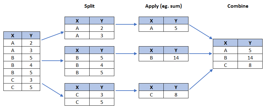
Step 1: Gather data. We will use pandas groupby method to summarize the immigration data by Continent. The general process of groupby involves the following steps:
Split: Splitting the data into groups based on some criteria.
Apply: Applying a function to each group independently:
.sum()
.count()
.mean()
.std()
.aggregate()
.apply()
.etc..
Combine: Combining the results into a data structure.
# group countries by continents and apply sum() function
df_continents = df_can.groupby('Continent', axis=0).sum()

# note: the output of the groupby method is a `groupby' object.
# we can not use it further until we apply a function (eg .sum())
print(type(df_can.groupby('Continent', axis=0)))

df_continents.head()
Step 2: Plot the data. We will pass in kind = 'pie' keyword, along with the following additional parameters:
autopct - is a string or function used to label the wedges with their numeric value. The label will be placed inside the wedge. If it is a format string, the label will be fmt%pct.
startangle - rotates the start of the pie chart by angle degrees counterclockwise from the x-axis.
shadow - Draws a shadow beneath the pie (to give a 3D feel).
# autopct create %, start angle represent starting point
df_continents['Total'].plot(kind='pie',
                            figsize=(5, 6),
                            autopct='%1.1f%%', # add in percentages
                            startangle=90,     # start angle 90° (Africa)
                            shadow=True,       # add shadow
                            )

plt.title('Immigration to Canada by Continent [1980 - 2013]')
plt.axis('equal') # Sets the pie chart to look like a circle.

plt.show()
The above visual is not very clear, the numbers and text overlap in some instances. Let's make a few modifications to improve the visuals:
Remove the text labels on the pie chart by passing in legend and add it as a seperate legend using plt.legend().
Push out the percentages to sit just outside the pie chart by passing in pctdistance parameter.
Pass in a custom set of colors for continents by passing in colors parameter.
Explode the pie chart to emphasize the lowest three continents (Africa, North America, and Latin America and Carribbean) by pasing in explode parameter.
colors_list = ['gold', 'yellowgreen', 'lightcoral', 'lightskyblue', 'lightgreen', 'pink']

explode_list = [0.1, 0, 0, 0, 0.1, 0.1] # ratio for each continent with which to offset each wedge.

df_continents['Total'].plot(kind='pie',
                            figsize=(15, 6),
                            autopct='%1.1f%%',
                            startangle=90,
                            shadow=True,
                            labels=None,         # turn off labels on pie chart
                            pctdistance=1.12,    # the ratio between the center of each pie slice and the start of the text generated by autopct
                            colors=colors_list,  # add custom colors
                            explode=explode_list # 'explode' lowest 3 continents
                            )

# scale the title up by 12% to match pctdistance
plt.title('Immigration to Canada by Continent [1980 - 2013]', y=1.12)

plt.axis('equal')

# add legend
plt.legend(labels=df_continents.index, loc='upper left')

plt.show()